

Real-time KPI dashboards
From data to direction—contextual KPIs for every function, in real time.

The KPI gap
Data ≠ Decision
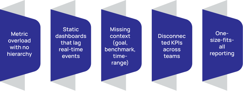
Common problems:
Design with purpose
Every metric tells a story
Calsoft builds purpose-aligned dashboards with:

Layered KPI design: strategic, tactical, operational
Real-time, event-triggered updates
Drill-down paths and interactive filters
Thresholds, goals, and forecast overlays
Embedded data narratives (tooltips, anomaly insights)
Cross-source joins (CRM, ERP, DevOps, IoT, Web)
Visualization toolkit
Tools we use. Tools you trust
We support:

- BI Platforms: Power BI, Tableau, Looker, Qlik, Superset
- Cloud-native tools: AWS QuickSight, GCP Data Studio, Azure Workbooks
- Custom dashboarding on React, Dash, D3.js
- Mobile & embedded dashboards (in apps, portals, products)
- Role-based access, drill-downs, and PDF exports

Real business outcomes
Beyond Pretty Charts
| Value Area | Impact |
|---|---|
| Decision latency | ↓ by 60% |
| User adoption of dashboards | ↑ to 90% with role relevance |
| Cross-team alignment | Weekly syncs reduced by 40% |
| Escalation reduction | ↓ by 50% with real-time anomaly visibility |
| Forecast accuracy | ↑ by 35% via embedded trends |
How to start
Visualize KPIs in 4 steps
Prioritize Decisions, Not Data
Start with business decisions you want to accelerate or de-risk.
Map Metrics to Personas
Define what each team or persona needs to see, own, and act on.
Test, Tune, Iterate
Use feedback loops and adoption metrics to improve clarity and relevance.
Design, Not Dump
Build dashboards that guide—not overwhelm—with contextual layers..
